What would brand logos look like if they matched their products
Categories: Design and Architecture | Positive
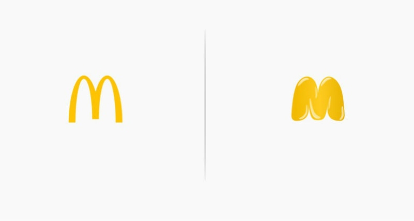
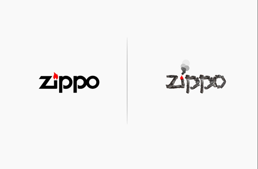
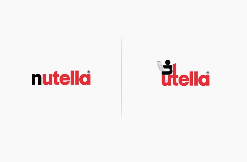
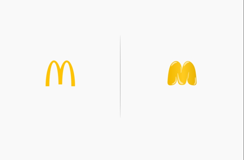
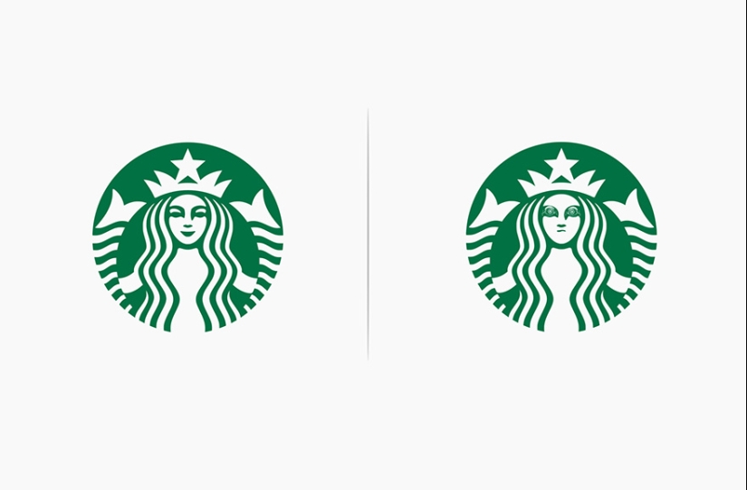
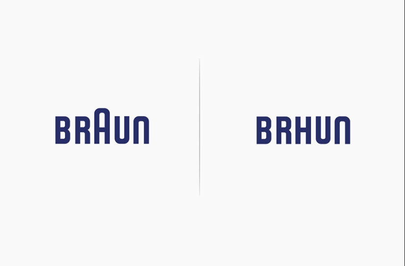
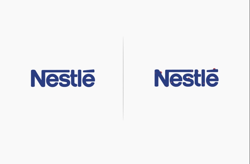
By Pictolic https://mail.pictolic.com/article/what-would-brand-logos-look-like-if-they-matched-their-products.htmlItalian industrial designer Marco Schembri presented what the logos of world-famous brands would look like if their products were tested on them. The famous " M " from hamburgers, cheeseburgers and other big macs would have swollen to indecency, and Nestle would have been covered with a rash. Marco's idea is as simple as it is brilliant. We will wait for the replenishment of his collection.

Keywords: Positive | Design and architecture | Art | Brand | Mcdonald's | Image | Logos
Post News ArticleRecent articles

It's high time to admit that this whole hipster idea has gone too far. The concept has become so popular that even restaurants have ...

There is a perception that people only use 10% of their brain potential. But the heroes of our review, apparently, found a way to ...
Related articles

Everyone wants the wedding day to become special and remain in the memory of the newlyweds, parents and guests forever. Well, no ...

These artists love cats, but also masterfully draw them, often complementing funny and life signatures. Meet! --> Russian ...

A music album is not only a collection of tracks, but also an example of fine art. Each cover carries a certain meaning, and behind ...

New Year's is a time to surprise and delight loved ones not only with gifts but also with a unique presentation of the holiday ...