How the authors of the logo with drawbridges "divorced" the budget by 7 million
Categories: Design and Architecture
By Pictolic https://mail.pictolic.com/article/how-the-authors-of-the-logo-with-drawbridges-divorced-the-budget-by-7-million.htmlSt. Petersburg has got a new tourist logo, which looks like a turquoise circle, against which the name of the Northern Capital is written in the original font. According to the authors, the company SPN Communication, the circle symbolizes the "turquoise northern sun", and the horizontal lines of the font, which were given a slope, are drawbridges. But netizens are sure that it was not bridges that were "planted" on the logo, but the city budget for a tangible 7 million rubles.

A few days ago, the new logo was presented by the St. Petersburg Tourism Committee to the public and the press at a special meeting dedicated to the meta-brand of the city. Anticipating the bewilderment of those present, representatives of SPN Communication hastened to declare that the logo itself is only a tenth of the large—scale work.

Perhaps in the pretentious slogan there was a hint of the work of the creators of the new brand, who managed to "create a great" for such a modest amount. Alas, not everyone appreciated the wonderful creativity of designers. There were immediately a lot of critics on the web who not only expressed bewilderment at the cost of the work, but also, following the laws of time, began to issue one meme after another.
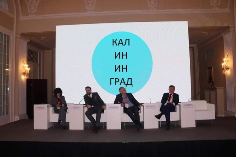
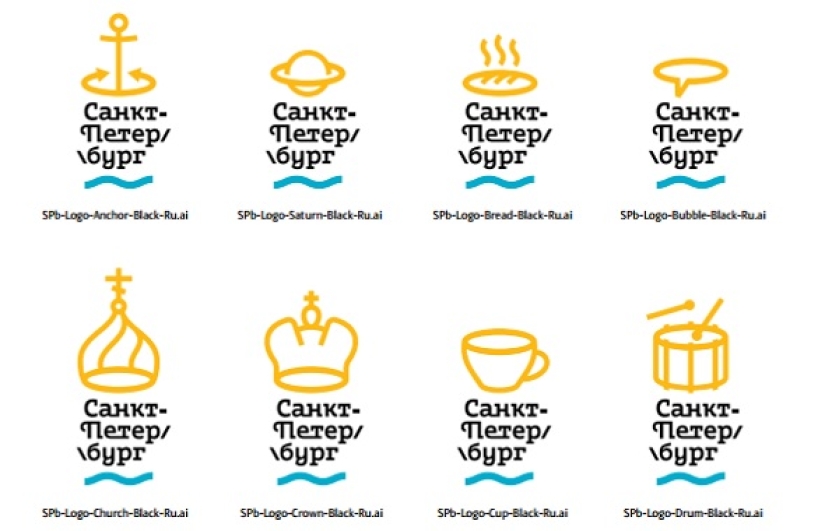
Literally just a day after the presentation on social networks, there are many variants of logos for other glorious cities of Russia, and, characteristically, absolutely free.
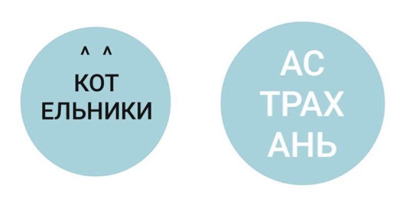
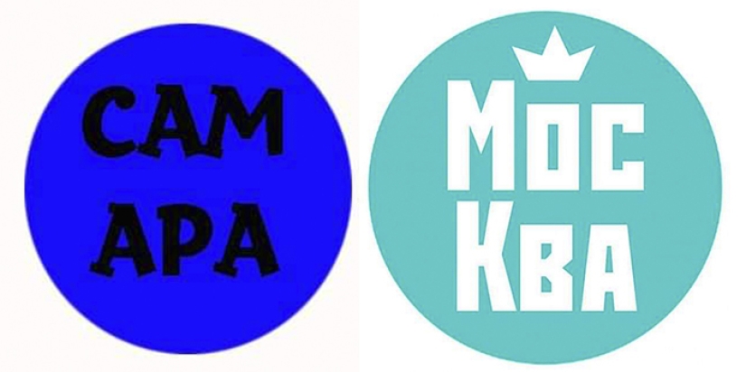
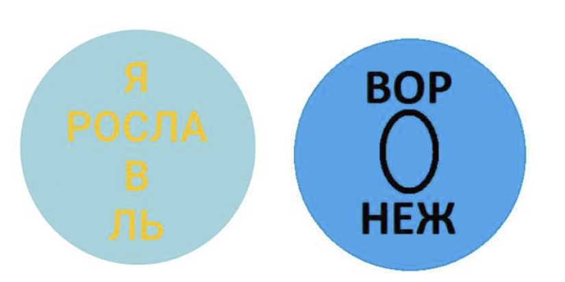
The Committee for Tourism Development of St. Petersburg, having learned about the network's reaction to the new city brand, thanked everyone for their active civic position and burst into vague explanations about the essence and purpose of an ambitious and therefore expensive project.
It is worth saying that creating logos for Peter, in general, is a thankless task. Once, Artemy Lebedev, known for his exorbitant self-esteem and no less impressive prices for his work, created a whole pack of logos for the city and took only one ruble for it.
The antimonopoly service became interested in this transaction, having found a whole list of violations and abuses in it. The logo itself was mercilessly criticized by the residents of the city and everyone who is not lazy, and therefore went to the archive, without taking its place on banners, stands and tourist avenues. But it's all right now, after the seven million deal, isn't it?
By the way, the experience of foreign colleagues shows that you can create a logo from anything, if your imagination would work.
Keywords: Budget | Logo | Millions | St. petersburg | Slogan | Tourism
Post News ArticleRecent articles

Most of us think that the color of the eggshell does not play any role and it is possible not to pay attention. But it's not and ...

The more we rely on technology, the more potential power hackers gain over us. It doesn't matter if their goal is to help or cause ...
Related articles

It is well known that the powers that be in our days, nothing. In this case, the sign of good tone is to hide the true revenue, so ...

According to the latest statistics, almost half of the families in Russia earn as much, that is only enough for food and clothing. ...

American Aaron Kraus (Aaron Krause) has achieved incredible success, it would seem, has long mastered the niche market of kitchen ...

Creating a good portrait is one of the most difficult tasks for any photographer. In order to make a really natural and memorable ...